XML Editor - Radio Button widget
This widget makes radio buttons available and can be used instead of the Popup-Menu widget. This is useful when the number of radio buttons placed in the widget is not very high.
Overview

The 'radio-button' widget using vertical orientation
The widget represents a list of values as a radio button group. In this group, no more than one radio button can be selected and as long as a different radio button is selected, the previous selection of a radio button is nullified.
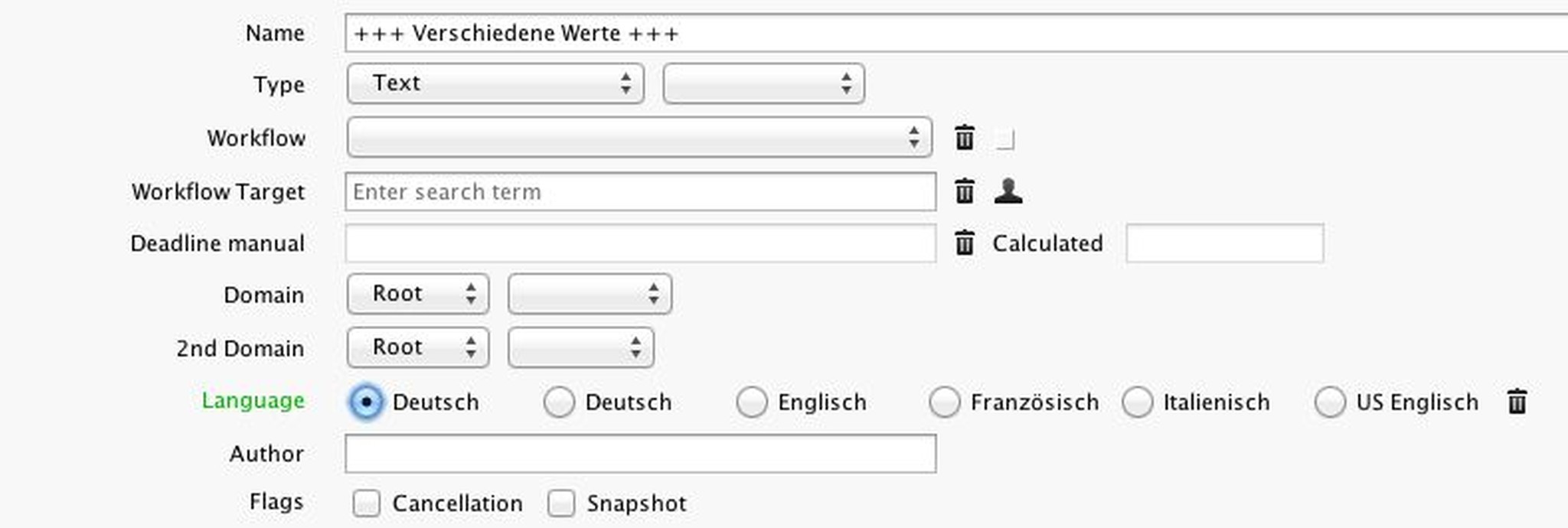
The 'radio-button' widget using horizontal orientation
The radio button 'Different values' (see Figure 1) is used when the selected assets have different values, for example, for the language. As soon as a common value for all widgets is selected, the radio button 'Different values' also disappears from the radio button group. An unknown or undefined value will be displayed with the radio button 'Unknown value'. In case of modified or invalid values, the frame around the radio button group is coloured green (or red).
Example
1. As illustrated in the following example, there is a 'radio-button' widget with vertical orientation (top to bottom), containing a list of languages defined as radio buttons:
<xe:radio-button label="Language" label-style="label-default" align="down" font-size="13" source="@language" sort="ascending">
<xe:options label-key="@name" value-key="@id">
<xe:generator name="cachedtables" table-name="language_def"/>
</xe:options>
<xe:listen-to source="@name"/>
</xe:radio-button>2. It is also possible to define the widget in a 'scrollpane':
<xe:scrollpane weight-x="1" height="5em" align="right">
<xe:radio-button label="Language" label-style="label-default" align="right" source="@language">
.......
</xe:radio-button>
</xe:scrollpane>Configuration
In the XML definition of the 'radio-button' widget, a new attribute named 'align' has been added to the 'popupmenu' attributes. Using this attribute you can specify the layout orientation.
The attribute recognizes the following values:
- for vertical orientation - see Figure 1
- for horizontal orientation - see Figure 2
It is also possible to add two imaginary radio buttons to a radio button group:
different value
unknown value
In the definition of 'radio-button' widgets with horizontal alignment, the' width 'attribute should either not be entered (especially if you do not know the exact number of the displayed radio buttons, for example, when using generators) or be aware that this attribute will get sufficient space for the displayed radio buttons.